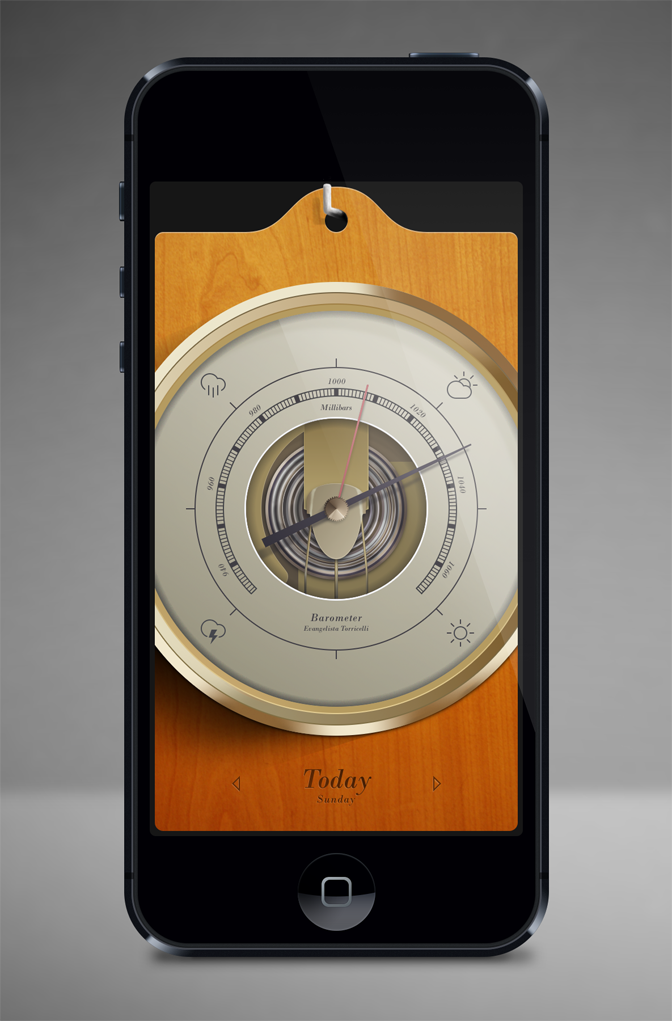
Designing a barometer app with skeuomorphic design philosophy involved creating a digital representation of a physical barometer instrument, complete with realistic textures, materials, and visual cues that mimiced the real-world counterpart. The process included several key steps to achieve an authentic and intuitive user experience.
Firstly, I thoroughly researched to understand the functionality and visual characteristics of traditional barometers. This included studying various types of barometers, such as mercury and aneroid, and their physical features like dials, needles, and weather-related indicators.
Next, the design phase involved translating these physical elements into digital equivalents. Skeuomorphic design relies on using textures, shading, and lighting effects to create a sense of realism. This could involve incorporating a metal or wood texture for the casing, using gradients to mimic reflections and shadows, and implementing subtle animations for the needle movement.
To ensure usability, the app's interface needed to be intuitive and easy to navigate. Skeuomorphic design can leverage familiar visual metaphors, such as a rotating dial or sliding indicators, to make interactions feel natural and familiar. The app also needed to provide clear and concise information, including current atmospheric pressure, weather forecasts, and historical data.
By adopting a skeuomorphic design approach, the barometer app offered users a visually engaging and familiar experience that resembles a traditional barometer, enhancing their connection with the digital instrument while providing valuable atmospheric information.
Want to discuss working together to solve your web and graphic design requirements? Send me an email at info@squarefountain.co.uk and I'll design you a creative solution!
