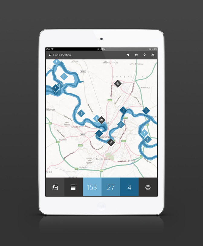
Designing an app interface using flat design principles involves creating a clean, minimalistic, and visually appealing user interface that focuses on simplicity and clarity. The process typically includes several key steps to achieve a modern and user-friendly design.
Firstly, understanding the core principles of flat design is essential. This includes utilizing bold and vibrant colors, employing clean and simple typography, and utilizing minimalist icons and illustrations. Flat design eliminates excessive textures, gradients, and shadows, resulting in a sleek and streamlined aesthetic.
During the design phase, it was crucial to establish a consistent visual hierarchy and layout. Flat design often utilizes grid systems to align elements and create a harmonious composition. This ensures that information is presented in a logical and organized manner, enhancing the user's ability to navigate and comprehend the app's content.
The use of vivid and contrasting colors plays a significant role in flat design. Selecting a limited color palette and employing color theory principles can help create a visually striking interface while conveying meaning and guiding user interactions.
Furthermore, incorporating simple and intuitive icons aids in user comprehension. Flat design favors minimalistic and geometric shapes, ensuring that icons are easily recognizable and universally understood. Clear and concise labeling complements the icons, enhancing the user's understanding of various functions and actions.
By embracing flat design principles, my design for the app interface can achieve a contemporary and visually pleasing aesthetic while promoting ease of use and enhancing user engagement.
Want to discuss working together to solve your web and graphic design requirements? Send me an email at info@squarefountain.co.uk and I'll design you a creative solution!
